top of page


Pivot Point Physio
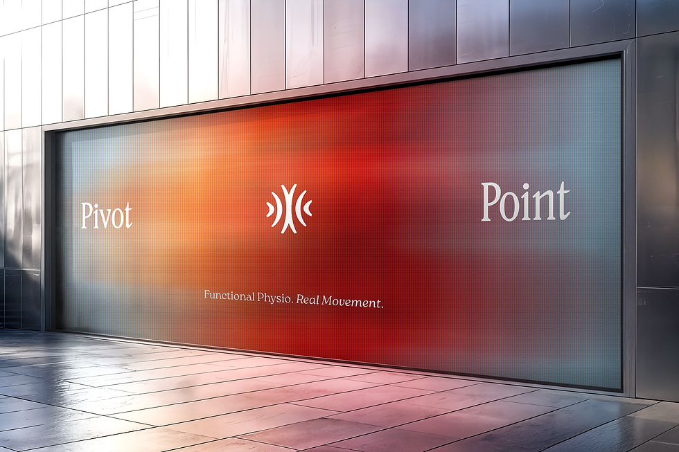
Pivot Point Physio is all about functional methods to recovery and physiotherapy. They wanted to stand out in an industry filled with clinical/sterile brands - bringing a warmer and more human approach the the design language. Our approach was to treat the brand more like it belonged in the health and wellness space opting for natural textures and colors combined with a theme of motion. The logo displays motion abstractly emanating from the center point of a perfect circle. Motion blur is added to florals and artistic images of people free in their environment.
LOGO, IDENTITY, PRINT


bottom of page